Effective Cartography
Mapping with Aggregated Statistics
This document discusses some principles for portraying quantitative statistics on maps. Our goal as mapmakers is to understand statistical information and to transform the data into graphics that will convey our understanding to a map reader. In this effort, we have to consider the way that graphics are turned into ideas in the mind of map users. As it happens, people have instinctive pathways of interpretation that we can use assure that our graphics are interpreted correctly. Conversely, if we do not understand these instinctive pathways, we can be almost certain to confuse our audience. Maps that reflect this understanding of the ways that symbolization is interpreted also reveal the fact that the mapmaker him/herself is confused about the data being presented.
IN this topic we will be looking specifically about the symbolization of statistics that record data collected for administrative units like counties or census tracts. There are two fundamental types of aggregated statistics from the perspective of thematic mapping.
- Raw Quantities: are measurable phenomena that add up, such as number of people, number of bushels of grain, gross profits or income. When one is trying to make comparisons of raw quantities, one has to be aware of the fact that the basis of each quantity may be different for each areal unit. The number of unemployed in each county may be presumed to be a function of the total number of workers. To use an analogy with sound, raw quantities may be thought of as volume or decibels of sound that are cumulative, that add up.
- Normalized Intensive Statistics: are rates that express the way that a raw quantity as a proportion of some basis. Examples of this include population density per hectare, mean or median household income, percent of workers who are unemployed. To continue our sound analogy here, normalized statistics are a distributed quality, like the frequency or pitch of a sound. This quality is presumed to be the same irrespective of the volume. One should be careful comparing normalized rates or indicators because in these measures,the basis is hidden. For example, a census tract with a high percentage of unemployed may have very few people living in it.
Fallacies: Intuitive Traps in Interpreting Data and Maps
It is a repeating theme in these tutorials about mapping, that people are prone to particular patterns of misunderstanding. The problem of comparing quanitities or rates without considering the unequal basis is one of these. Therefore, a person who makes maps should first make sure that he or she has not fallen into that trap herself, but that she also devises a map and a discussion that helps the audience to steer away form the trap.
References
- Spatial Models for Decision Support and Scholarship
- Elements of Cartographic Style
- Fundamentals of Census Data
- Census Mapping Tutorial
- Example Demographic Maps
Instinctive Pathways for Graphical Communication
Our problem today is to explore patterns in demographic data and to make maps that portray the patterns in the data in a concise, effective way. Although mapping software gives us a great deal of freedom in how we portray quantitative statistics, the software is not smart enough to understand what we are trying to communicate, and more importantly, how people will interpret our maps. It is very easy to create maps that communicate ideas that are wrong. A major focus of this page is to illustrate some of the built-in mechanisms in the human mind for turning graphics into information. As an example, we will look at the examples of relief shading near the bottom of the GSD GIS Manual Page about Digital Elevation Models. Then we will look at some of other intuitive pathways for turning graphics into ideas.
Modes of Representing Aggregated Statistics
It is very common that our data reflects summaries of observations that have been tabulated over areas of unequal size. Examples of tabulations include the count of population within the tabulation area; the count of unemployed people within the tabulation area. In both of these cases, the domain over which the count is taken may be an important factor in determining the size of the count. In the case of population, or housing units, all other factors being equal, a larger inhabitable area will have more people or housing units. In the case of unemployment the domain from which the count is taken, i.e. the number of people of working age in the tabulation area would be a critical determinate of the number of unemployed. The problem of unequal and arbitrary tabulation areas requires us to be very careful in interpreting and symbolizing tabulated statistics on maps. This difficulty is also compounded by innate ways that people turn graphical stimuli into information (or misinformation) about quantities and their distribution over space.
There are two fundamental modes of representation for quantities associated with geographic areas:
- Choropleth Symbols use the tabulation areas themselves as a symbol.
Choropleth symbols, using shades of increasing color value are appropriate for portraying and comparing
measures of intensity. Choropleth maps are very common and can be an effective way of
characterizing a distribution -- however, using choropleths as symbols can be problematic
because the size of the area is arbitrary, and if statistics are not normalized, it can be
inapropriate to compare reaw counts that happen over unequal domains.

Click here for more images of choropleth maps Choropleth maps are sisters to Isopleth Maps.
- Proportional Symbols portray a stastistic as a symbol that is scaled in proportion to the
quantity in question. These symbols are placed near the center of the aggregation area.
Symbols that scale in one dimension (e.g. height) according to the value of the statistic are
appropriate for visualizing and comparing raw count statistics.

Demonstration:
It turns our that humans, and probably other animals have built-in, instinctive ways of converting visual stimuli into information about quantity and intensity. If our goal is to communicate our ideas, we should understand and use these innate capabilities. The following images will demonstrate how your innate visual computer allows you to instinctively compute graphics to quantitative ideas:
Intuitive Understanding of Quantity from Graphics

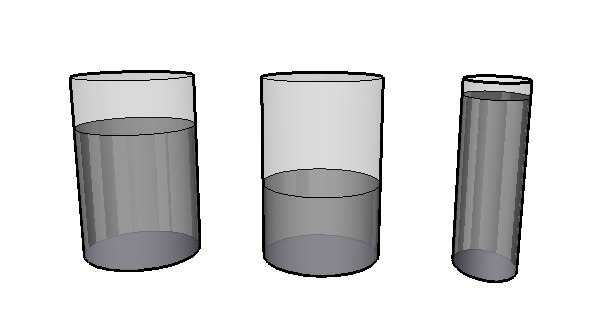
I want to communicate to you about the relative quantities of liquid in these jars. DO you have an idea of the amount of water in the right-hand jar and the jar in the middle? How about the jar on the left? It is easy to judge that the middle jar has about half the quantity of water as the jar on the left. We can instinctively compute this without even thinking because the basis for each jar is the same, we need only to look at the height of the liquid. It is essentially a one-dimensional problem.
To translate this into cartographic terms:
- People understand quantity as related to size.
- It is easy to compare sizes when it varies in a single dimension
- Cartographic symbolization of quantity is best understood when symbols vary in size along one dimension.
Intuitive Understanding of Intensity from Graphics
Now I am going to put a drop of poison in each of the jars, and lets shift
from a discussion of quantity to a discussion of intensity.
 How much poison is in each jar? One drop. If I asked you which jar you
would rather take a sip from, you would not need to know anything about
the quantities involved to make your choice. Your built-in evaluation
instincts read the intensity (or value) of the color and without thinking
you will judge that the right-hand jar has a weaker concentration or intensity
of poison in it.
The cartographic lesson from this demonstration:
- People can easily understand intensity or concentration as the intensity or value of color.
- The best way to communicate intensity is to use shade symbols of the same hue (e.g. Red) with the value increasing with the intensity of the statistic.
Choropleth Maps, Count Statistics and Intensity Measures
Choropleth Maps are maps that shade geographical areas according to statistics tabulated for each area. These are some of the most common statistical maps. Choropleth maps are very effective in creating a mental impression of the spatial pattern of statistical information.Many datasets available for use in geographic information systems contain information regarding counts of individuals for specific geographic areas; for example, "Population for Census Tracts" or "Number of Unemployed by Census Tract." One of the most common mistakes made by beginning cartographers is to make a choropleth map that colors each tabulation area according to the value of a count statistic.
The problem is that Choropleth maps ask us to compare tabulation areas, but because the areas are almost always arbitrary in size and population (e.g. zip codes, provinces, counties, census divisions.) When we characterize these areas by counts, we are comparing them on unequal terms. Naturally, a larger tract will have more people. All other things being equal, we would expect a tract that has more people to have more unemployed people in proportion to the total number.
To normalize, in a statistical sense, is to transform a set of measurements so that they may be compared in a meaningful way. Technically, normalization involves factoring out the size of the domain when you wish to compare counts collected over unequal areas or populations. Normalization transforms measures of magnitude (counts or weights) into measures of intensity.
Examples of normalization:
   Population Density = Count of Population / Land Area
   Percent Unemployed = Count of Unemployed / Number in Workforce
The two choropleth maps of population above reveal two distinctly different patterns of population distribution for Eastern Massachusetts. The map of the raw count statistic: Persons Per Census Tract reveals the fact that many larger tracts in the suburbs have more people than most of the urban tracts, which are smaller in area. The map on the right shows population normalized by land area: Persons per Hectare. The normalized map reveals that, once the size of the tract is factored out, the smaller tracts are more densely populated.
The viewer of the map interprets the darkness of each color shade as representing intensity. The darker areas appear heavier and draw attention. The map on the left promotes the idea that, with respect to population, there are large, intense areas in the suburbs, which is false.
Understanding the Domain of a Count
In normalization of count statistics, the choice of the denominator depends on the question being investigated. For example, to investigate the impact of automobiles on the environment, the appropriate normalized statistic might be Autos-Per-Hectare, to investigate a question of commuting behavior, Autos-Per-Household could be more appropriate.
Deciding When to Normalize
Now that you have been warned to normalize count or weight statistics, we should point out that there are several types of statistics that are not appropriate for normalization. Summary statistics, such as averages, medians, or percentages are already measures of intensity and should not be normalized.
Proportional Symbols
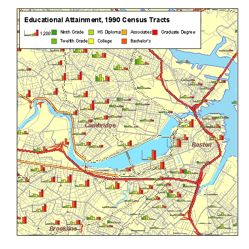
There are ways of appropriately symbolizing raw count data without normailzing. Proportionally sized symbols, such as bar charts or pie charts, serve more effectively in situations that call for map comparison of raw counts.
In the example above, each census tract has a row of bar charts, the height of each bar determined by the number of people having attained a certain level of education. Note that since the the boundaries of the tracts are shown, the user's eye can weigh the amount of color in the bar chart, and compare it with the size of the area around it; as opposed to a choropleth map where the weight of the colored area is related to the size of the arbitrary tabulation area.
This technique reveals interesting patterns within and among census tracts. Note that the bar charts in tracts along the Charles River slope up -- having short green bars (high school) and tall red bars (college). In the north, there are tracts whose charts slope down, indicating a relative majority of people with lower levels of education. Can you find tracts that are home to a diversity of educational attainment levels?
Avoid these Tempting Logical Traps!
The Modifiable Areal Unit Problem
Last but definitely not least, you should always keep in mind and in the forefront of your interpretation of maps, that thematic maps are about data -- not necessarily a reflection of what is happening on the ground. The GSD GIS manual page about Critique of Data and Metadata has more complete discussion of the potential gotchas in interpreting data. Here we will provide an example of the Modifiable Areal Unit Problem. Examine the pattern of Population Density in at the Block and the BlockGroup level on These maps of Union Square It is the same area, the same date, the same statistic and the same level. Different configurations of areal units converys a distinctly different representation of how residents were actually distributed.
To avoid falling into the MAUP trap, keep reminding yourself and your audience, that your aerial units are not homogeneous in their composition.
- Make sure you use the finest granularity data that is appropriate for your purpose, and
- In your discussion you should should clearly refer to the Areal Units in your data. For example, don;t say" the Union Square neighborhood has on average, 100 housing units per hectare. Say "According to the 200 census, the Block group that cobers union square has a density of 100 housing units per acre. Let the subject of your map and your discussion be about the data first.
For many purposes, Blocks might be fine-grained enough that the MAUP may not matter. People don't stay in their blocks, but that's another problem.
Mark Monmonier has a good chapter on the MAUP in his book, How to Lie with Maps. You may also learn more from the Wikipedia Page on the MAUP.
Fallacies of Ecological Inference
Working with aggregate data can lead us to jump to conclusions that are not well founded by our data. For example, if we can portray on a map that census tracts that have a higher proportion (say 20%) of adults having attained graduate degrees, and we have another map that shows a strong correlation of the same tracts with higher educational attainment also show a higher than average tendency (say, 20%) of residents use bicycles as their primary mode of transportation to work; we might be tempted to make a remark that our maps show that people with graduate degrees are more likely to ride bicycles to work. This claim is an example of an Fallacious Ecological Inference that is not supported by the data. I We have no way of knowing that the same 20% of people who ride bicycles is the same 20% who have graduate degrees.
It is important to avoid these traps while yuou are trying to undertsnd systems, and it is also important that you choose words carefully when you describe systems so that less savvy observers wil not fall into a predictable mis-interpretaion, and savvy customers wil lsee that we have not fallen into the trap.The secret to avoiding both of these traps is to follow the prime directive when discussing data. Admit that you are discussing data that originated with a certain methodology and precioin: spatialy and categoricaly. When your observations are packaged as census tracts, Tracts should be your subject, not people. If people are the things that you are concerned with, you should make sure to mention the pertinant errors of comission and omissions that mightr be made when you are forced to use census tracts, or counties.


